How To Easily Create Blog Images That Get Clicks
Did you know that 90% of the information transmitted in the human brain is visual? And that visual content is processed 60,000 times faster than text?
With these kinds of stats it is no wonder that there continues to be a rise in visual content online. Infographics are great for disseminating facts and figures in a way that is easily processed, while unique blog images can be the difference in whether or not you get a click.
Images serve many purposes on your blog. They break up the content so large quantities of text are managed more easily. They help to tell your story and to emphasize important points. As well, images tap into emotions which again is great for clicks.
And let’s not forget social sharing. Images are often the main reason someone shares one of your posts. Needless to say, images are important.
But what kind of images do you need?
Stock images can be costly over time as is hiring a graphic designer. Copyright free images are great, but the problem is that millions of other people are using the same images as well. Have you ever been to a website and recall seeing the exact same image somewhere else? This happens to me all the time.
The key therefore is to create custom images. Ideally your goals should be twofold: 1. branding your business / blog, 2. creating for the purpose of getting clicks.
Neil Patel says that this naturally scares many blog owners, but it doesn’t have to. There are some simple strategies and tips that you can use to make this quite effortless.
Here Are The Best Tips We Found For Creating Custom Images
Tip #1: An Image Within An Image
If you want to create great custom images, you’ll need images for your images.
Confused? Let me show you what I mean.
Take this featured image from Neil Patel’s post on QuickSprout Why Link Building Is NOT the Future of SEO:

Inside of that image, there are many separate images:
- the background
- the woman looking at the whiteboard
- all the individual graphics on the whiteboard (the line graph, the word “SEO”, etc.)
When creating custom images, you’ll often need to combine several standalone images.
Neil says that “you can’t just take any image you find on Google because it might be protected by copyright laws. While you might get away with it for a while, you could also get sued overnight and be drawn into an expensive lawsuit.” So pay close attention to the license before using any images. (source: QuickSprout)
Tip #2: Effective Screenshots For Tutorials
For those who enjoy creating how-to and tutorial content, screenshots are essential. Free tools like Jing will allow you to not only capture screenshots, but also easily annotate them. Annotations help make your points or instructions crystal clear to readers who need a little visual supplementation.
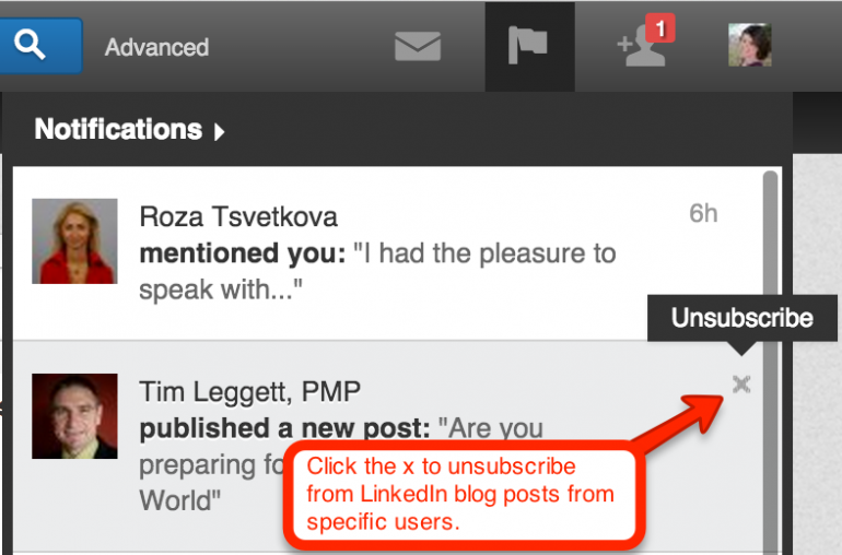
People will not only appreciate your ability to illustrate your points clearly, but you’ll also get requests from others who want to share your annotated screenshots. Use those requests to get your name in front of new audiences without any additional work.
Another great tool for screenshots is FooCapture. You install the extension on Google Chrome and use it to capture screenshots, annotate them, and have them automatically added to your WordPress (WordPress.com or WordPress.org) media library. Premium service plans for this tool is only $6 per month for unlimited connections / WordPress connections. (source: Kristi Hines)
Tip #3: Create Original Art
In a world where we’re bombarded with information, anything new stands out from the crowd and catches our attention—on any platform, at any time. Take advantage of that and be part of the 20% of people who create original content for the other 80% to share.
When you create original images, they’re yours to keep. You can use them in any way you want, whenever you want.
You never have to wonder about breaching copyright, reading the fine print on a stock photo or making the big mistake of using an image from Google Images. (A quick reminder: Don’t use images you find on Google; it’s not a stock library.)
You don’t need to hire a graphic designer to create original images. You can do it yourself with the advice and tools listed below.
If you’re at your desk, you can use image-editing tools like Canva or PicMonkey. Both offer gorgeous (and handy) templates. Use them to create 5-10 images with a similar theme.
As you become skilled with one tool, add another tool or app to your design kit. When you find something you love, stick with it for a while until something else strikes your fancy. (source: Social Media Examiner)
Tip #4: Text Over Image Graphics
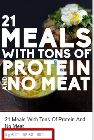
Creating your own customized text over image graphics for your blog posts can do some pretty awesome things for your blog. They can:
- Make your blog appear much more professional
- Increases credibility and trustworthiness of your content
- Boosts click-through-rates from social media sites
- Increase shares and likes
Numerous studies have already shown the advantages of posting images alongside your articles on social media sites. When those images are customized title panels promoting your article, you are pretty much guaranteed to see HUGE jumps in your metrics. (source: Word Stream)
Tip #4: Make Picture Quotes
Picture quotes are wildly popular on Facebook, Twitter, Pinterest, Instagram – everywhere! People love to share quote images that resonate with them.
There are numerous tools available for this. Some of our favourites include: Share As Image, PixTeller, and QuotesCover.
Consider the typefaces and fonts that you are using.
Serif vs Sans
It is commonly accepted that serif typefaces are easier to read for lengthy copy than sans serifs, especially at smaller sizes. This is true in many situations, but not an absolute rule. Other factors to consider before making your decision include the reading environment, meaning whether it will be in print or on the Web, and the design characteristics – especially the legibility – of the typeface being considered. For a more detailed explanation, read Serif v. Sans for Text.
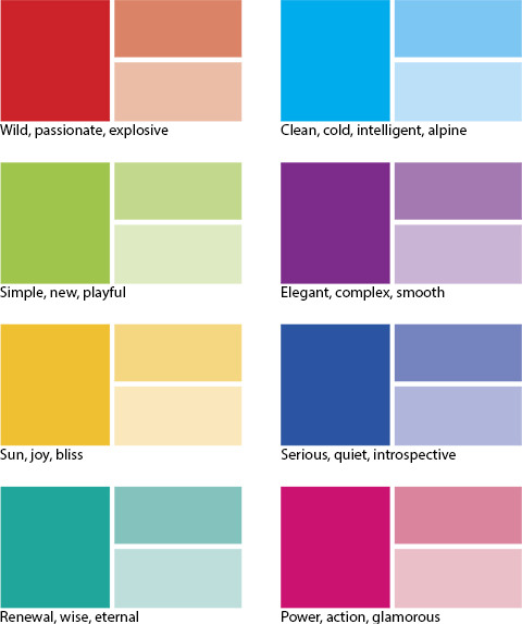
Understanding the basics of colour theory is also helpful. This way you are able to select colours that invoke exactly the emotion or feeling that you want.
Colour Theory 101
A color scheme (or color palette) refers to the group of colors you use in a project, a painting, or your living room. Just take a look at any book cover, magazine ad, or website and you’ll see that it’s made from a certain set of colors. The designer usually picks a main color and then chooses the other colors according to how they look together and the feeling they evoke when they’re viewed as a group. There’s a whole science behind picking colors based on what they mean to us humans and how they make us feel, as shown in the image below. Those meanings and feelings can differ according to geographic location. For example, hospital rooms and public spaces are typically bathed in pale blue or green because those colors have a soothing effect, while a popular chain of truck stops (Loves) are swathed in bright yellow and red to keep drivers awake and alert, and Apple stores are predominantly white to reflect a feeling of elegance and simplicity. (source: MacWorld)
Tip #5: Rule of Thirds
The Rule of Thirds is a method for composing the elements of an image to be visually pleasing and to be in sync with the way our eyes prefer to scan an image. Photographers know the Rule of Thirds well; it is a foundational piece of photography.
The way it works is by dividing an image into a grid of thirds both horizontally and vertically. Basically, put a tic-tac-toe board on an image.

The tic-tac-toe board creates intersections of lines, and according to Rule of Thirds, these intersections are where the eye is most likely to be drawn.
The design lesson here is to place your key elements along these intersections. Avoid placing a key element right in the center. (source: BufferApp)
Tip #5: Create a Meme
Memes are great to get lots of social sharing. They generally consist of funny or cute images with captions that instantly stirs up emotions making you laugh, think, react in shock or ah, etc.
MemeCrusher is an excellent tool that lets you quickly and easily make memes. All you need to do is select a template, create the meme, and post instantly to Facebook, Pinterest, or WordPress. MemeCrusher has 39,000 built in quotes, tons of fonts, effects, and colours.
Tip #6: Create a Product Collage
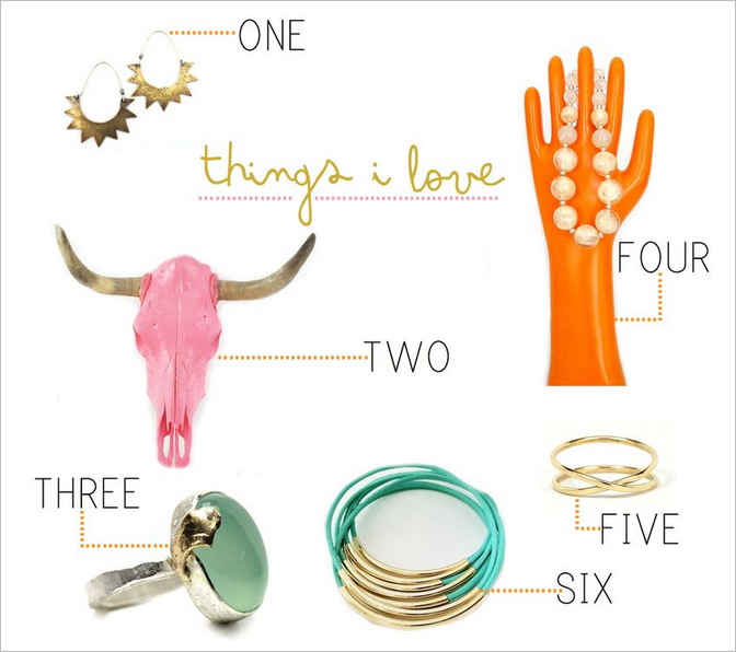
Product and photo collages are great for social sharing. There are a number of different ways to make them and several great tools available.
Click here for a super easy tutorial using Adobe Photoshop Element.
Tip #7: Create a Blog Graphic Using Icons
My next go-to method is to add icons. You can create simple, effective graphics just by adding a few simple icons to it. This image was for a post about how content combined with marketing automation can lead to new clients. Originally I was going to design something fancy to illustrate the point, but then I realized I could get a similar effect in five minutes if I used three free icons.

For the graphics within the post I used icons from The Noun Project to represent each season. This explains at a glance the concept that took a few paragraphs to explain with text in the original post.
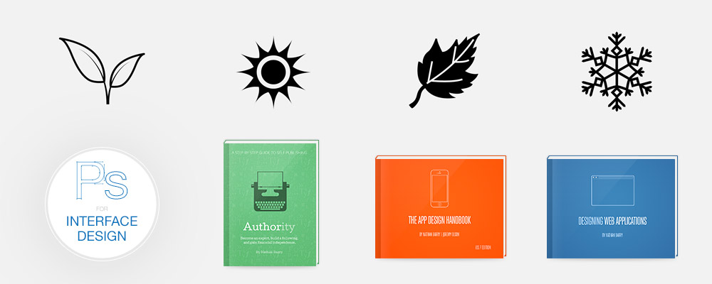
And finally, here’s one more basic illustration made entirely with free icons for my post on creating and consuming content on different devices: (source: Nathan Barry)

Tip #8: Branding Your Business
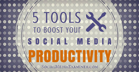
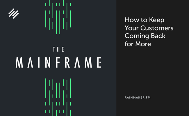
The best way to quickly starting branding your blog online is to create a specific style for your images. It can be as simple as adding your logo, using similar colours and effects, and so on.
The key to strong branding is consistency. What this does is that it makes your image memorable and directly linked to you and your blog.
Some great examples of branded images include:
1. Social Media Examiner
2. Rainmaker
3. Content Marketing Institute

Final Thoughts
Creating unique blog post images will not only increase social sharing, but will also drive tons of traffic to your website. There are lots of different options to choose from. I recommend doing case studies to see what works the best for your blog.
If you are using images from various websites don’t forget to read the license. Some will require that you link back, some will not allow commercial use or derivative works, while others will allow you to use images freely like Pixabay and MorgueFile.
Also, think about branding. It’s important to create blog graphics that are easily recognizable. At the very least include your logo in the graphic. Remember, your blog post images can make the difference between getting the clicks or not. So make them interesting, high quality, and eye catching.
